People these days are preoccupied with data. Odds are, if you’re a writer, student, or young professional in virtually any field, you will need to make a chart at some point. If you don’t have the data to back up your points, people are likely to question the validity of your statements.
That’s why it’s important for you to be able to have a rudimentary understanding of data and data visualization. We call this basic understanding data literacy.
Basic data literacy begins with an understanding of how to use the most common charts. Once you know the best practices of data visualization, you will be able to recognize a good dataviz from a bad one.
Here are the quick and dirty tips for how to use the four basic chart types you will come across: pie charts, vertical bar charts, horizontal bar charts, and line charts.
1. Pie chart
Make a pie chart when you want to show parts of a whole. Don’t use them when you want to show complicated relationships between many segments. This means that their use is more limited than other charts, but people love pie charts so you’ll still probably want to use them often.
- Don’t use more than five slices, or your chart will become difficult to read. If you have more than five numbers to chart, label the fifth slice “Other.”
- Place the largest segment on the right at 12 o’clock, then place the second largest segment on the left side at 12 o’clock and order it from largest to smallest on the left. The only exception to this rule is when all the slices are close in size, where you can order them from largest to smallest in clockwise order.
- Use direct labels, rather than a legend. This just makes it easier to read.
- Don’t use three-dimensional effects, as they can misrepresent data. Basically, don’t use any embellishment that isn’t relevant to the data.
- Add a description when further context or clarification is needed.
-
2. Vertical bar charts
Use vertical bar charts to demonstrate discrete quantities (quantities divided into units, like numbers, as opposed to continuous quantities, like duration).
- Don’t use three-dimensional bars. They look outdated and they make it difficult to determine where the top of the bar is on the grid.
- Always start the baseline at zero. Because vertical bar charts show discrete quantities, starting it at a higher value truncates the data.
- The space between each bar should be half the width of the bars themselves.
- To include estimates and projections beside actual values, simply use a different shade for that one bar.
- If the bar height differences are hard to distinguish from one another, try presenting your value differently. For example, plot changes in percentages rather than the actual number.
- Keep multi-bar charts to no more than four categories. Otherwise, it will become difficult to compare bars, even if you use different colors.
3. Horizontal bar charts
These are basically vertical bar charts that are lying down. This kind of chart is particularly useful for ranking items by the same attributes, with the longest bar at the top of the chart and the descending to the shortest.
- Try to keep your chart to four or fewer categories.
- Don’t alternate between light and dark bars to show different variables.
- Order your lines from largest to smallest. If you want to highlight a specific bar, make it a different color. The exception to this rule is when you are ordering values alphabetically for easier reading.
- Don’t use grid lines and a scale, if possible. It’s better and clearer to directly label the bars.
- If you’re plotting values by units of time, order bars from most recent at the top to oldest at the bottom.
- For graphs with many bars, break up the bars into sections of three to five using a thin horizontal line. This makes them easier to read.
4. Line charts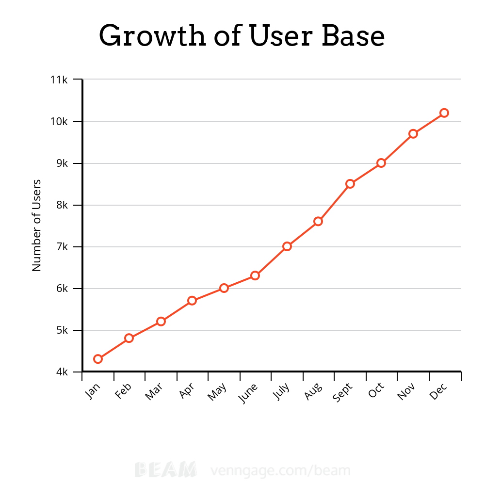
Line charts are great for showing data over a period of time.
- Use a line width that isn’t too thin or too thick, especially on a chart with multiple points. Pick a width that stands out against the grid lines but that still separate each individual point.
- Scale your y-axis so that the height of the line occupies two-thirds of the chart area. This way, the line won’t be too flat (which obscures the data) or two steep (which overstates the data).
- Don’t use more than four lines in a single chart. Things get stressful when you overlap too many lines. Contrast three or four data series that show a difference. You could also create a panel of individual line charts to compare multiple data series.
- Don’t use a bunch of different line styles, like dashed lines and different shape markers. It’s best to stick to solid lines.
- Label lines directly. This allows readers to identify lines quickly, rather than looking for the corresponding values in a legend. Also, don’t label points with big blocks of text. It’s messy.
- Charts created using Beam, the free chart maker.
The post How to Make the Four Basic Chart Types appeared first on Lifehack.
from Lifehack http://ift.tt/20sagil


Nenhum comentário:
Postar um comentário